Define a Grid & Keep it Simple
Grids are important tools for most types of design. Breaking out of them in the wrong ways can create cognitive hurdles in your user’s experience, and it can diminish the beauty of your information design. But, once you have an understanding of why they’re important, you can break out of them in explorative, interesting, and purposeful ways.
It’s advantageous to keep your grids simple, with larger and fewer columns. Complex grids do not lead to simple designs.
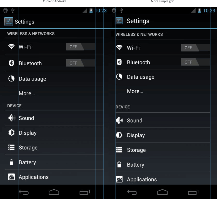
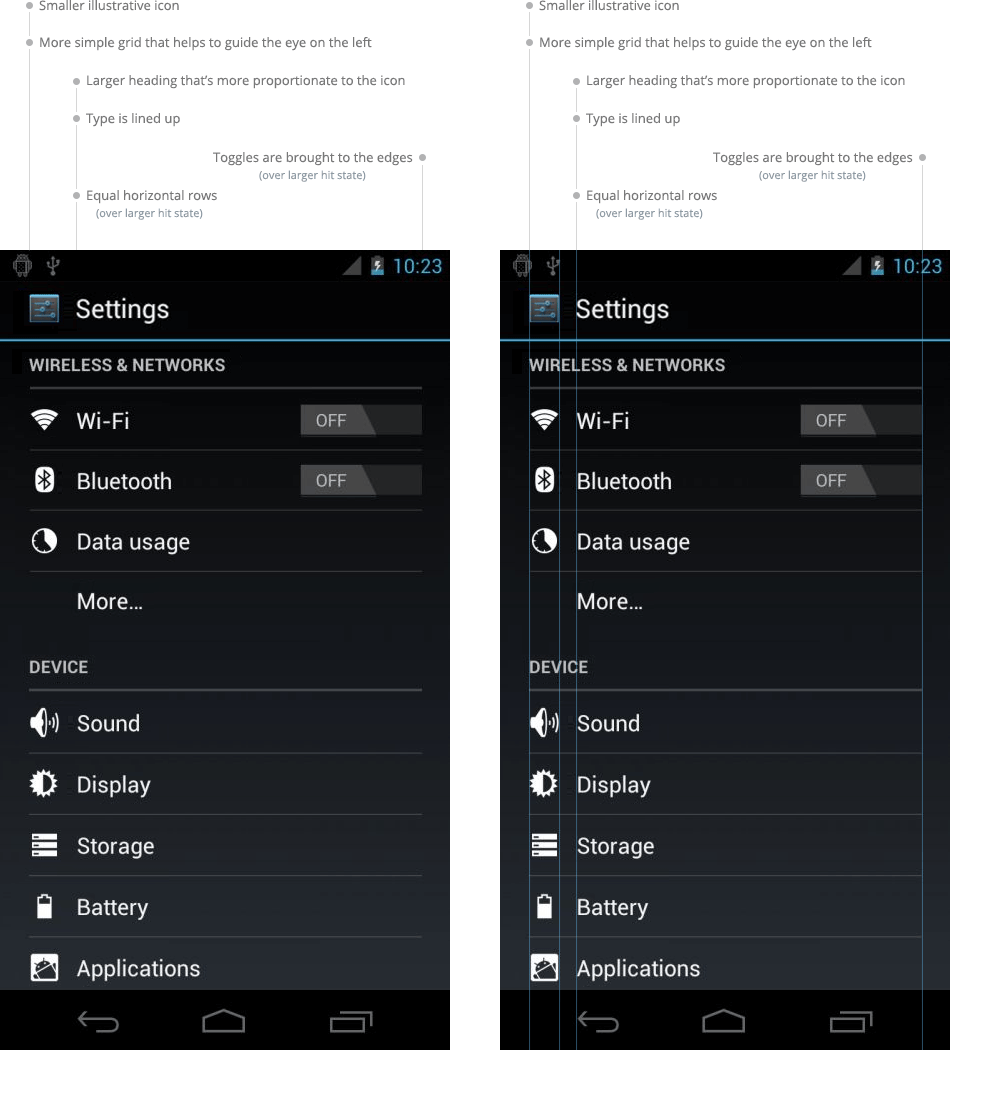
Below, I’ve included a comparison of Android’s current settings interface against one that I created with a simplified grid. The list layout that’s used here is standard across Ice Cream Sandwich, the latest version of the Android operating system, and I think this screen could feel much more balanced and purposeful. Using a strict grid also makes it easier to digest.

Here’s a breakdown of what I’ve done.
